
When speculation began in mid-2024 that Sarah Burton would be the ideal candidate to continue Hubert de Givenchy’s legacy, it was clear that the fashion house knew exactly what it was looking for. They wanted a designer capable of translating bold concepts that challenged the established codes of a society that tends to favour simplicity and a more formal, technical and straightforward visual language, while still remaining accessible. Her professional background at Alexander McQueen, where she worked for ten years and took over as creative director in 2010, was also a very important precedent in understanding her appointment. She had demonstrated her ability to work with pattern-cutting and tailoring, as well as to construct complex silhouettes and transform them into garments suitable for everyday wear. Finally, in September of that same year, she was appointed creative director of the fashion house.
The collection is built around a diverse visual language based on aesthetic elements such as silhouette construction, fabrics, prints and accessories. Sarah Burton begins with technical precision in pattern-cutting, modifying proportions and transforming garments by shifting silhouettes and their dimensions. This becomes an expressive tool. Colour contrasts, asymmetry and prints take on a significant role throughout the collection, making this duality a fundamental part of her aesthetic language. Our attention is drawn to the different elements present in each design and to the materials themselves, generating interest in the possibilities of a garment capable of bringing together functionality and expression, as well as structure, rigidity and fluidity. As Sarah Burton explains during the collection presentation, the transformation of recognisable garments and the relationship between structure, spontaneity and sensuality are all part of her proposal.
The tailoring, the body and the sensuality of contemporary femininity proposed by Sarah create a tension between revealing and covering the body, between discipline, represented here by tailoring, and freedom of movement. These opposing elements aim to transform garments into something recognisable while also introducing new ways of understanding them. This relationship between the body and clothing is approached from the perspective that fashion is also a way of constructing one’s image and relating to the surrounding environment.
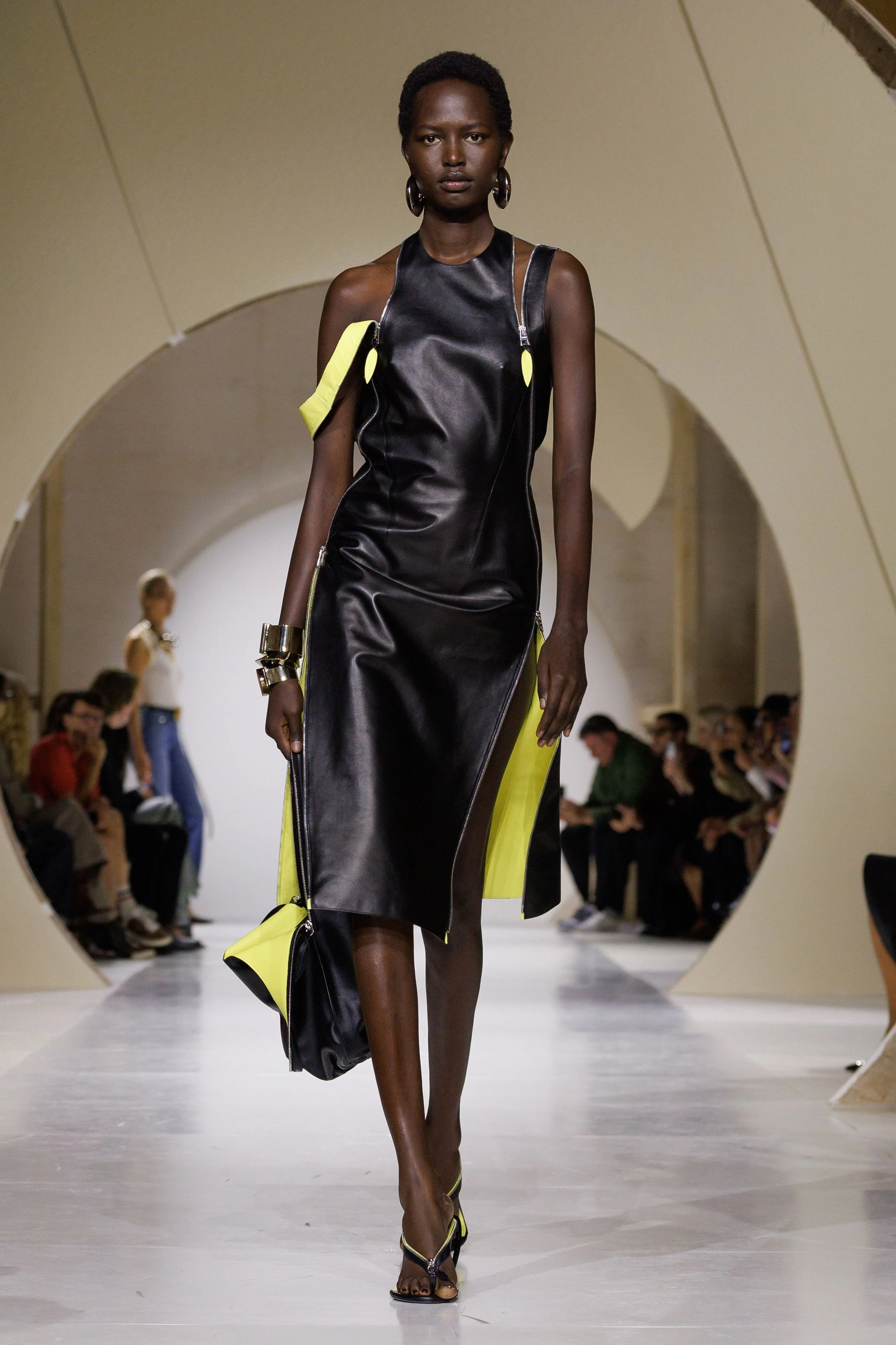
For this reason, she seems to be searching for balance and clarity through a wardrobe that is simple and capable of adapting to different situations in everyday life. To begin with, the show opens with a black leather dress featuring curved zips that reveal a striking yellow lining. It establishes a contrast between darkness and visibility through the idea of protection and exposure: a garment that covers the body while simultaneously allowing us to glimpse what lies beneath. This tension appears in different ways throughout the show, both in trousers and more utilitarian garments and in designs that seem to convey a more defensive structure. Off-the-shoulder pieces and knitted tops introduce softer lines and a sense of sensuality that contrasts with this initial idea.
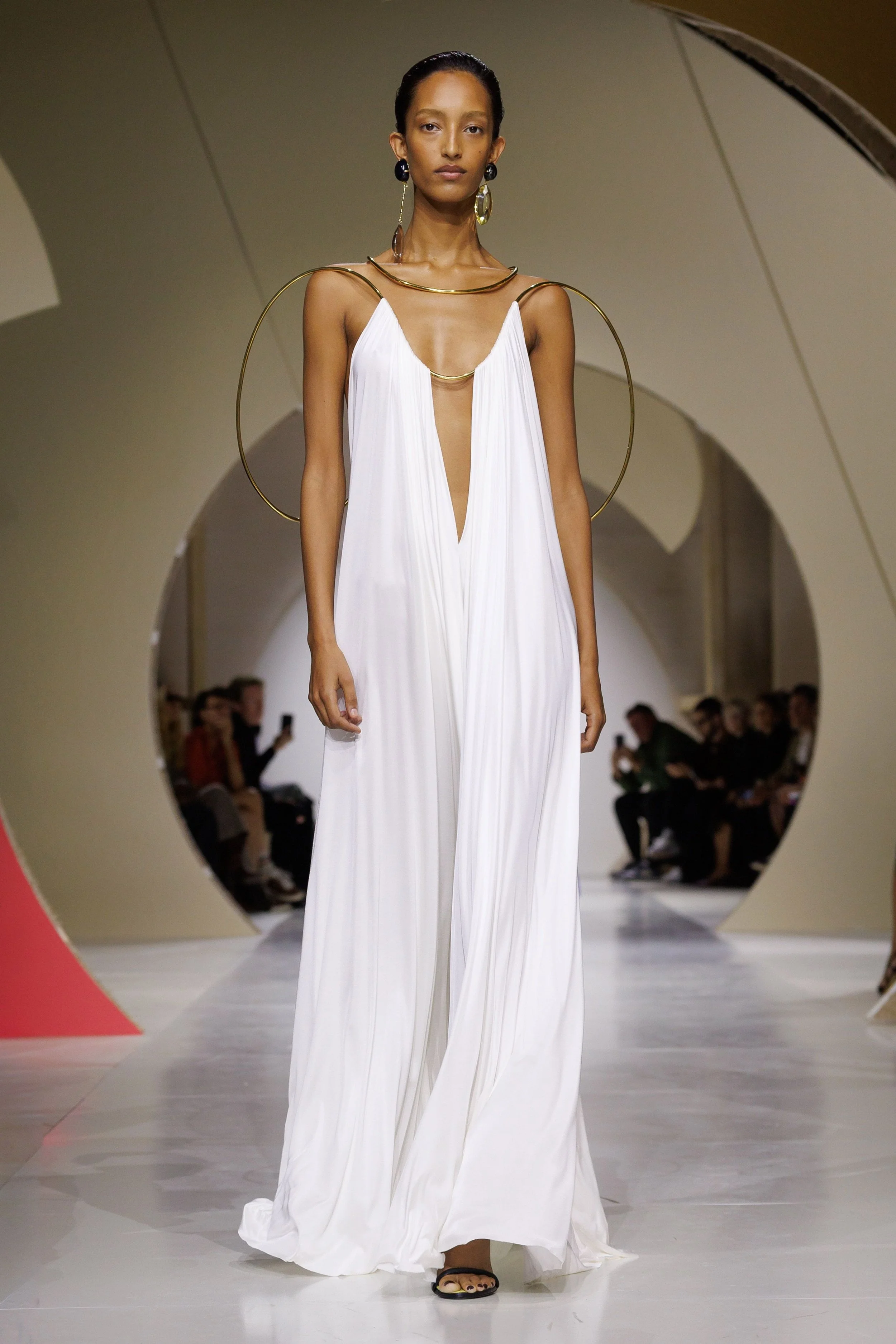
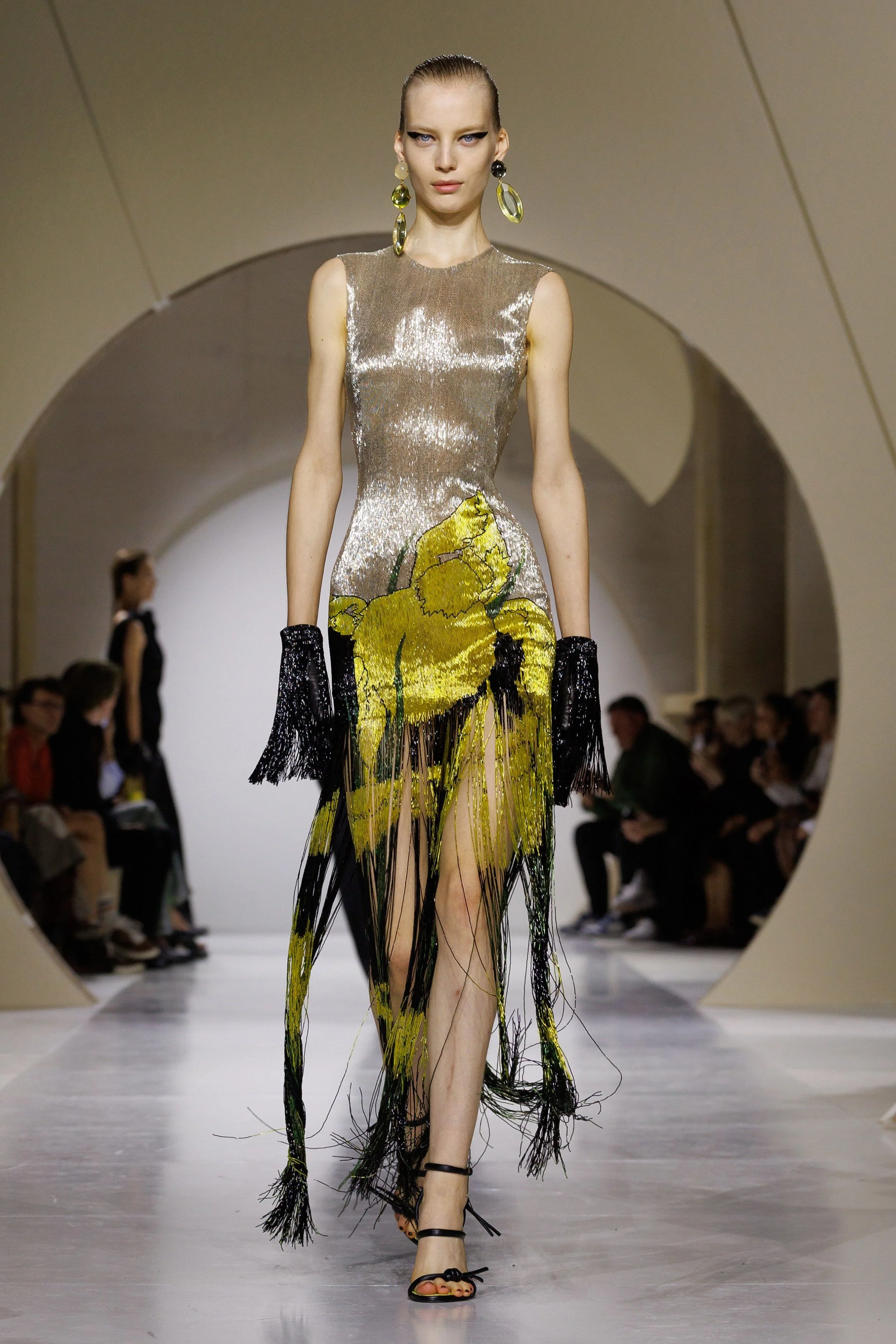
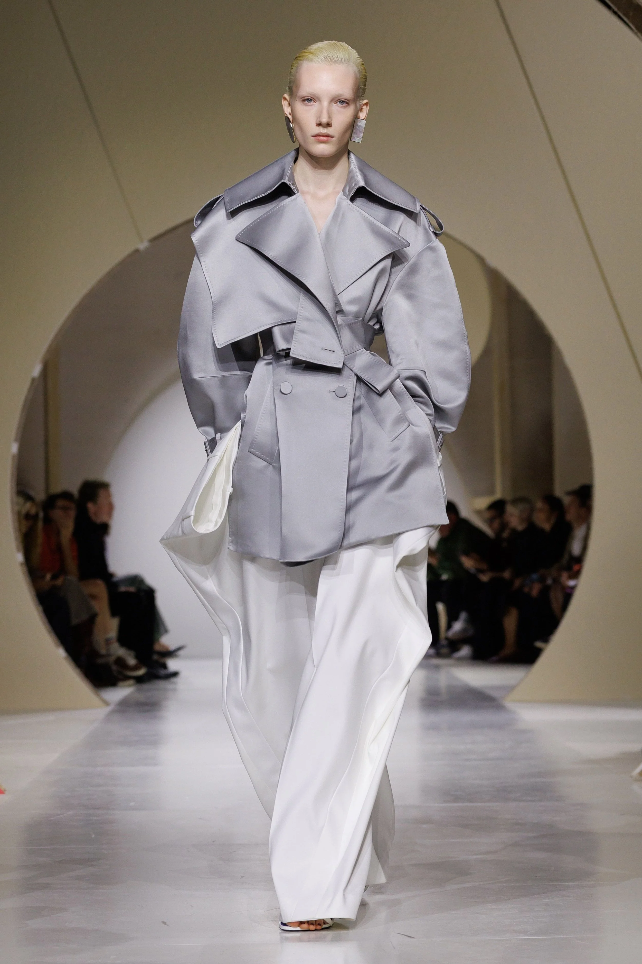
The suit becomes one of the main protagonists of the collection, reinterpreting traditional codes through inverted lapels, layering and oversized sleeves that almost become sculptural elements. Asymmetry also takes on an important role, as it is not simply an aesthetic feature but something that modifies the structure of the fabric and the proportions of the body. At the same time, trench coats and shirts take on a new role, reinterpreting classic elegance through the deconstruction proposed by Sarah Burton. In the eveningwear, silks, fringes and lighter fabrics create different dimensions against the body and the wool used in some garments. Pleated and embroidered surfaces also appear, creating volumes that seem to extend beyond the body. Some of these curved structures, suspended through the use of wire elements, appear to defy gravity and create an almost sculptural sense of balance.
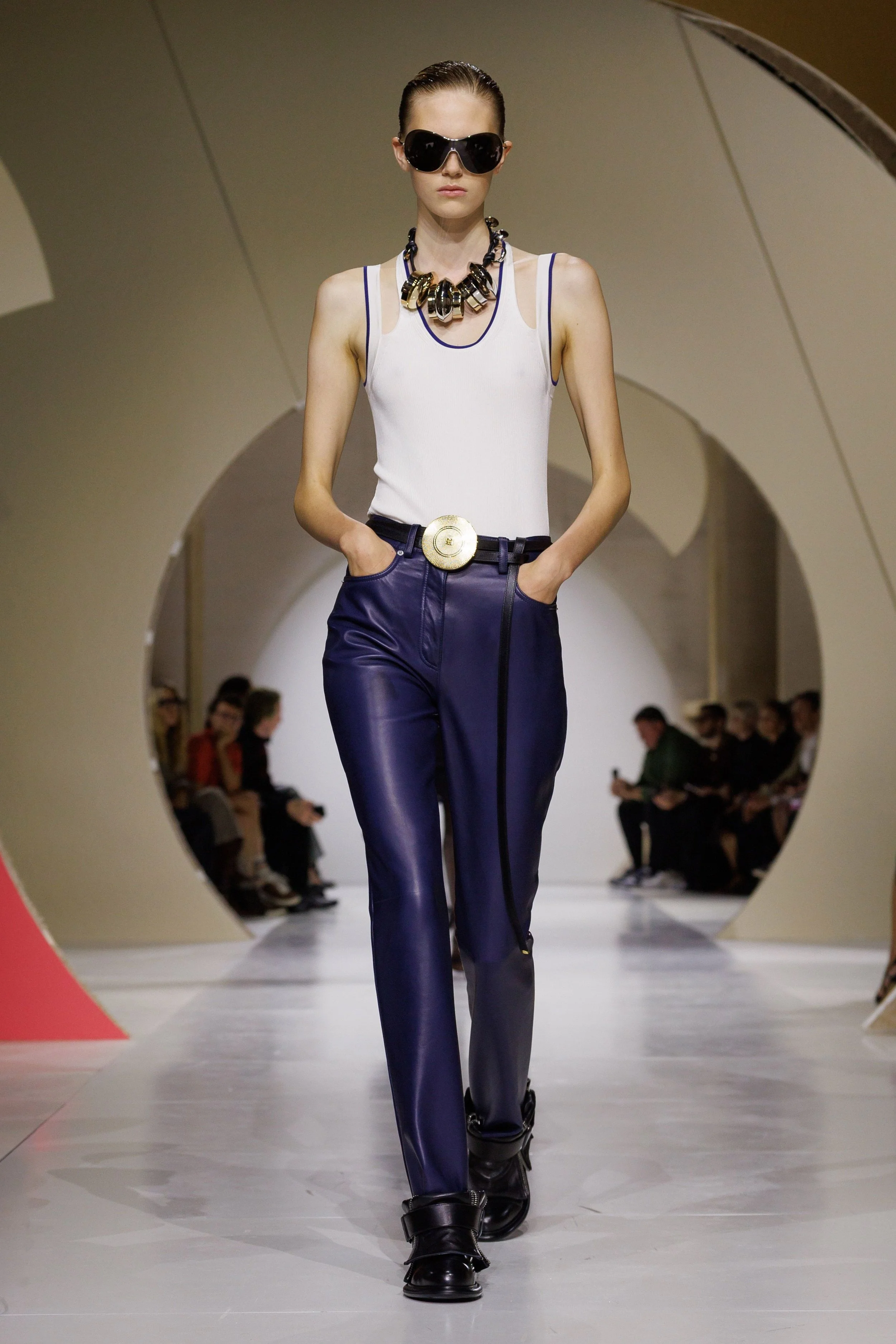
The colour palette revolves around black, white and navy blue, reinforcing the presence of classic codes, while acid yellow, red, electric blue and green introduce a disruption to the continuity of the more understated silhouettes. These contrasts create a dialogue between the inside and the outside, changing the way we perceive the garments.
The staging complements the collection’s aesthetic diversity and helps present multiple possibilities within a single proposal. The music and its variations seem to accompany a feeling of constant change, becoming a way of moving between different registers of the visual narrative. The show is not perceived simply as a succession of garments, but also as an experience in which rhythm and the presentation of the designs can influence the way we interpret them. As for the set design, it led me to develop an idea that I will return to later, but which I would like to introduce here: the possible relationship between Bauhaus aesthetics, its geometric shapes and colour contrasts, and some of the visual elements present in the collection.
However, during this latest show, when Sarah Burton explained that she wanted to communicate a sense of balance and clarity through precise and simple clothing, capable of adapting to the multiple perspectives and constant movement of our lives, a question came to mind. Her approach seemed coherent and offered a very interesting way of understanding fashion. However, when looking at the final result, I began to wonder whether she had actually managed to communicate that clarity or whether, on the contrary, she had ended up accumulating too much information. Were the looks too different from one another? And what was she trying to communicate through each of their individual elements?
For me, the collection is built around two extremes. On the one hand, we find garments whose main strengths are their construction, technical precision and ability to transform an apparently simple silhouette into something more complex. On the other hand, there are volumes, prints, asymmetry, striking accessories and very different historical and artistic references. This is where I find the core of the issue. The problem is not necessarily all the elements Burton wants to incorporate into the collection, but rather the difficulty of bringing them together and the relationship they establish with one another within each design.
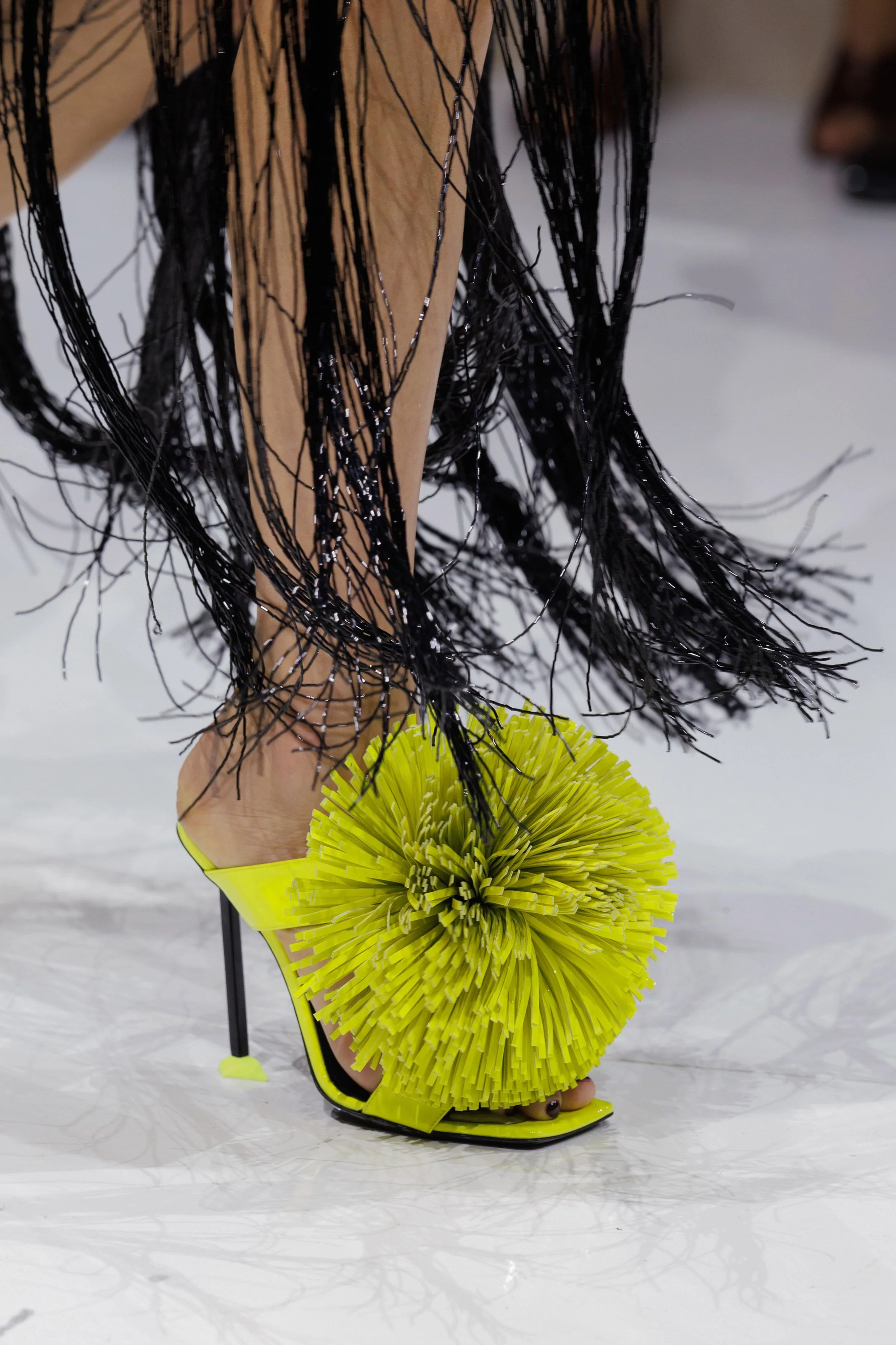
Some elements can have a double meaning, as with the zips that appear on the heels, while others simply change the way we perceive a garment, as happens when jeans are combined with shorts that visually resemble hipster-style underwear. These are details that can easily go unnoticed if we look at the show superficially. For example, the belt, an accessory we incorporate into our outfits almost every day, is transformed through a buckle that opens up to store makeup. Similarly, the zips on the heels no longer serve only their usual function but become a visual design feature. These details demonstrate a desire to transform everyday objects and introduce new possibilities within design.
With this in mind, I would like to raise a question: to what extent can a proposal be considered clear when part of its meaning requires the audience to recognise references and details that may not be immediately obvious? Especially when the designer speaks about clarity and simplicity, it is reasonable to question whether all these elements reinforce that idea or whether, on the contrary, they end up competing with one another.
This is why I believe the collection has received both positive criticism and some of the same criticism that has followed her from previous collections. This aspect becomes particularly relevant when considering the professional position Sarah Burton was in, as the preconceived image of her from her time at McQueen did not necessarily work in her favour. People associated her design codes with those of Hubert de Givenchy, particularly in terms of the sculptural treatment of the body and a strong artistic sensibility that combined technical skill with emotional depth. When she joined Givenchy, numerous comparisons emerged between the two fashion houses and between what the audience expected from her as the new creative director. But to what extent is Sarah Burton’s own identity being lost? Is she trying to do something completely different to avoid being confined to the image she established at her previous fashion house? If this is the case, she may be taking fewer risks and distancing herself so much from her personal visual language that her own creative identity struggles to become established.
The point is not to ask her to repeat what she did at McQueen, but rather to consider how she can use her own creative tools within a fashion house such as Givenchy, with such a distinctive history and different needs. It is not about repeating the codes that defined her previous chapter, but about integrating the most recognisable elements of her personal language without allowing them to disappear under the pressure of building a new identity.
What remains present in both Sarah Burton and Hubert de Givenchy’s work is their attention to the female body and to the way its proportions can be constructed through lines, cuts and volumes. Elegance does not necessarily depend on excessive ornamentation; it can also emerge from the way a garment is constructed and how it suggests, follows or transforms the body. Burton revisits this possibility through patterns and silhouettes that create tension and volume using different materials. In some of her designs, construction therefore takes on an expressive function, establishing a relationship between the body and the garment that goes beyond decoration. This is one of the most interesting connections I see between the designer and the history of the fashion house, although it does not mean that their respective visual languages are identical.
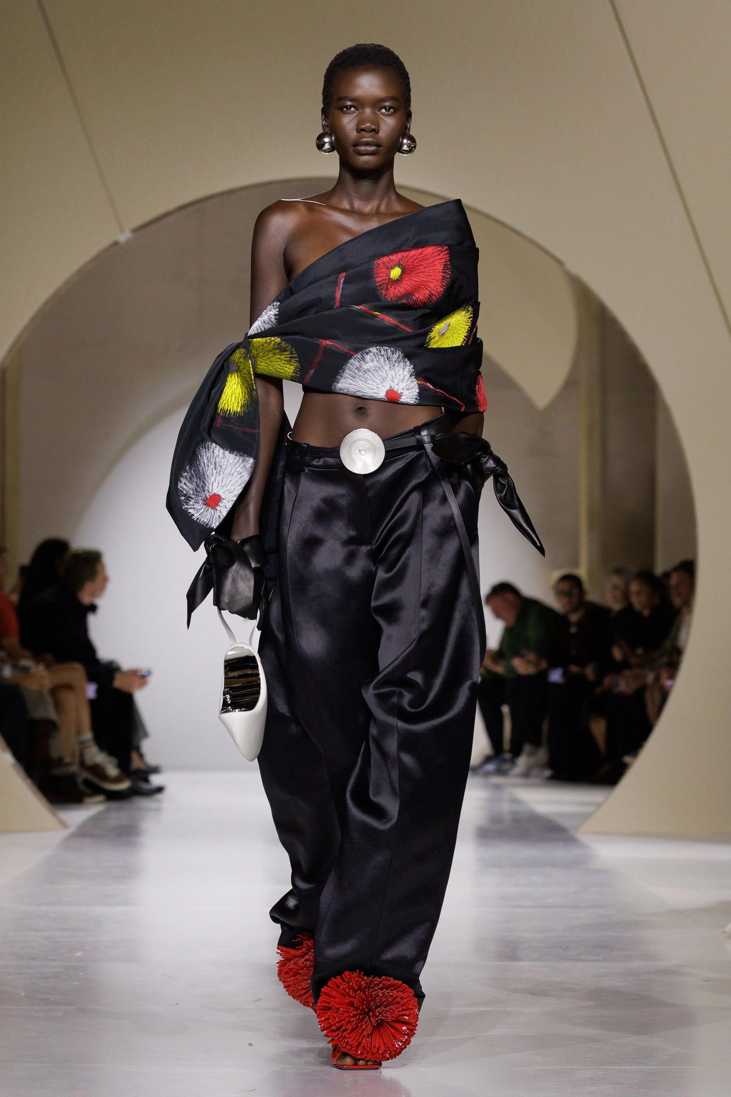
On the other hand, the opposite risk is also present: garments that are too flat, without creating tension or establishing a defined personality. At certain moments, this neutrality is noticeable, while in others, volumes and prints accumulate, creating a rather complex visual intensity that can blur the original purpose. Look 53 is an example of this issue. It combines shoes with pom-poms, a voluminous, printed and asymmetrical top, and extremely low-rise trousers whose fabric falls at the back in a way that can visually resemble a train. Each of these elements introduces a different focal point, which raises the question of whether the overall look manages to establish a visual hierarchy or, on the contrary, creates a certain sense of overload. I do not necessarily consider the combination a mistake, but it does raise questions about the relationship between the different design elements and which one ultimately organises the overall image.
Look 55, on the other hand, makes me question the presence of graphic motifs that seem to evoke Japanese prints. The lines, colours and arrangement of the elements across the surface are particularly interesting because the fabric is not simply understood as a material, but also as a surface capable of containing a landscape, an image or a cultural reference while simultaneously covering the body. Comparing it to Japanese printmaking can be useful when analysing how this surface is organised and how the pattern changes our perception of the garment, although it would be necessary to distinguish this visual similarity from any documented direct influence.
But what happens when these Japanese-inspired motifs appear alongside workwear-inspired garments, deconstructed silhouettes or accessories with a more evocative character? Does this combination reflect a vision of contemporary womanhood, or is it simply a reference whose place within the collection is difficult to understand, much like the dresses made from sequined fabrics and those elements worn on the hands?
And what about the heels with zips that we mentioned earlier? How could they be conceptually connected to the Bauhaus approach to the relationship between form, function and material? This comparison allows us to analyse how a functional element becomes part of an object’s visual structure. However, what really matters is examining what this transformation contributes to the design and how it relates to the rest of the collection.
Having said all this, I do not think the solution is to reduce the number of concepts included in the collection in order to fit an idea of clarity understood as visual simplicity. The proposal seems to be based on the idea of a multidisciplinary woman who moves through different spaces throughout the day and needs different ways of relating to her wardrobe. The challenge lies in communicating this diversity in a way that allows all the elements to support the overall narrative without losing its original coherence. This does not mean that the garments have to be simple or visually restrained. On the contrary, bringing different concepts together within a single visual language can be much more complex than simply reducing them.
For this reason, I believe Sarah Burton is still in the process of defining her position at Givenchy, trying to understand how to transform the fashion house’s codes and build her own legacy. Perhaps her goal is not to follow exactly what the audience expects from her or to prove that she is still the designer we knew at McQueen. Maybe her interest lies precisely in finding a connection between pattern-cutting, experimentation and a visual intensity that sometimes feels excessive, while attempting to weave Givenchy’s historical codes together with a more contemporary understanding of womenswear.
It is within this tension that I find the collection interesting. The point is not to demand that Sarah Burton goes back to being who she once was, but to observe how her visual language evolves, where its limits lie and to what extent she manages to transform her different references into a coherent proposal. Her work at Givenchy deserves to be followed precisely because this search still raises questions and because, in fashion, building your own identity does not necessarily mean repeating what has already worked, but finding new ways to express it.
Words by @patriciahl.05
Translated by @alraco43