
When Less Becomes Language: Prada’s New Direction
What do you think of Prada’s new logo?
Beyond the visual update, perhaps the real question is what kind of conversation the house is trying to open at this moment.
In a context where many brands tend to expand their identity to excess, more symbols, more narratives, more noise, Prada seems to be moving in the opposite direction. A strategy of reduction that goes beyond visual language and extends into the way the brand approaches fashion as a whole.
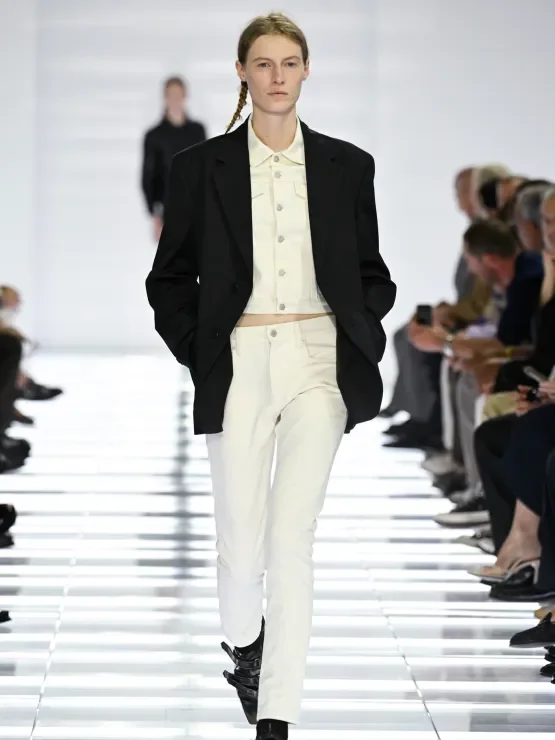
This same logic was evident in the Men’s Spring/Summer 2027 collection presented in Milan under the title Clarity. Miuccia Prada and Raf Simons proposed a conscious exercise in reduction: not as an aesthetic gesture, but as a position. The aim was not to simplify as a trend, but to refine by removing.
The result translated into a series of looks built on restraint. Reworked denim, technical leather, sharply cut blazers and garments with visible construction formed a recognisable wardrobe, slightly displaced from its usual context. Everything felt familiar, yet subtly recalibrated.
Rather than seeking immediate impact, the collection worked through persistence, through the idea that a garment gains relevance not from what it adds, but from what it chooses to leave out.
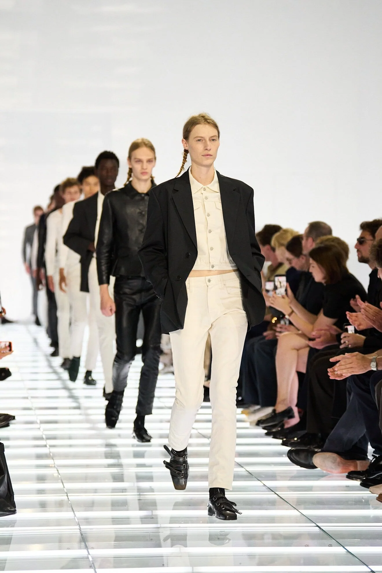
The show reinforced this narrative through its setting. A futuristic runway, crossed by cold light and transparent structures, placed the collection in a space suspended between the industrial and the conceptual. A frame that, rather than distracting, emphasised the sobriety of the clothes.
At this point, it is worth pausing on something that will likely define many conversations around this show: the accessories. What do you make of them?
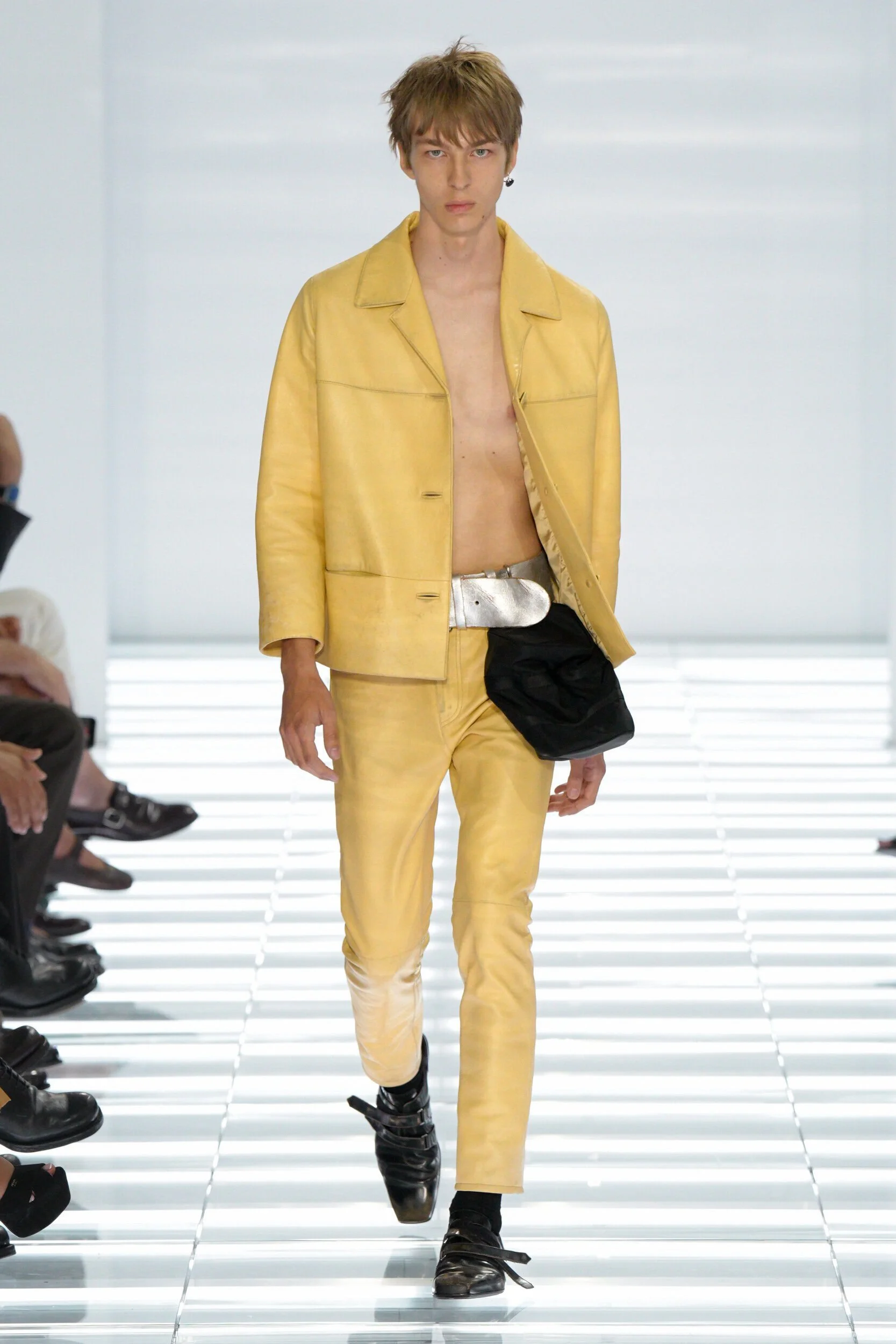
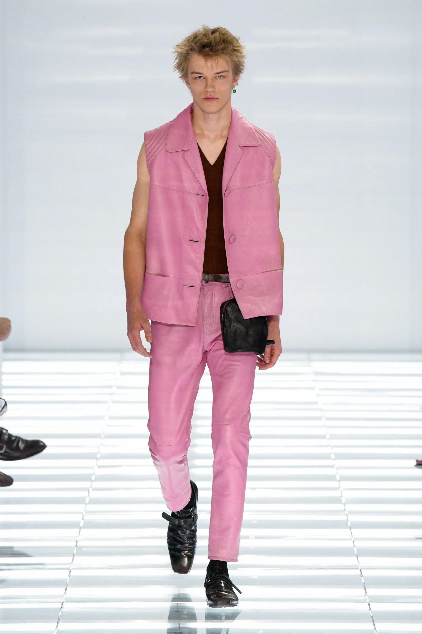
In Prada Men’s Spring/Summer 2027, they once again take centre stage, as is often the case for the house. From the new logo direction to the shoes, the eyewear, and the mini keychain-style pouches, these elements become the true language of the collection, distilling its most recognisable seasonal gestures.
More than a closed narrative, Clarity functions as an open system. The pieces do not impose a single reading, but instead suggest multiple ways of wearing and interpreting them. Prada is not dictating a uniform; it is proposing a framework.

And here, the parallel with the house’s visual identity becomes particularly interesting. The new logo does not feel like an isolated graphic exercise, but part of the same editorial decision: to reduce elements in order to reinforce meaning. Not to disappear, but to recalibrate presence.
In this sense, both the collection and the visual language point in the same direction: a vision of luxury less dependent on excess and more focused on precision.
Perhaps this is the real reading of Prada’s current moment. Not a rupture, but a progressive refinement, an attempt to redefine what remains when everything non-essential is stripped away.
And in an industry that so often moves through accumulation, that choice feels, at the very least, significant.
WORDS: @annaamaso